
Create a beautifully harmonious home.
A complete colour and material system, ready to use

A complete colour and material system, created for you,
by interior architect Heini Hansio
Choosing a single paint colour or material is easy. The challenge is bringing every element together into one beautiful, harmonious whole.
Interior Harmonies takes the guesswork out of the process. Paint colours, cabinetry, wood, natural stone, flooring, textiles, metals and accent colours have all been carefully selected to work beautifully together.
Rooted in timeless Nordic beauty, Finnish nature and biophilic design, each harmony creates a calm and harmonious foundation for your home — a place where natural materials take centre stage and you can truly feel at ease.
Discover the Interior Harmonies

Launch Offer!
One colour harmony is more than enough to create a modern and inviting home interior. By varying the accent colours and contrasts, you can create different moods throughout your home. Some rooms can be lighter, while others can be deeper and darker.
The price of one ready-made harmony, a complete colour and material plan is €169.
Each harmony includes a beautifully designed digital guide with carefully selected paint colours, materials and detailed instructions on how to use them togehter.
Purchase your own harmony now at the launch price of
€129
Avoid costly mistakes and endless second-guessing
Costly mistakes when choosing materials
Flooring, natural stone and cabinetry are significant investments. Each Interior Harmony brings together carefully selected colours and materials designed to work beautifully together - helping you make confident choices and create a cohesive, harmonious interior.
Colour clashes between shades
Conflicting undertones in colours and materials can create visual restlessness, particularly across large surfaces. Each Interior Harmony takes the guesswork out of the process. The colours and materials have been carefully selected to work beautifully together and create a calm, harmonious flow throughout your home.
Choices based on someone else´s aesthetic
Trends and inspiration can be helpful, but your home should ultimately feel like you. Each Interior Harmony has it own distinctive character, allowing you to choose the one that feels most naturally yours, and make it personal through art, objects and the things that carry meaning for you.
What´s included in every harmony
5 PAINT BRANDS
Colour references for Farrow & Ball, Little Greene, Benjamin Moore, Sherwin-Williams and Tikkurila.
WOOD FLOORING
Carefully selected wood flooring options from two internationally available manufacturers.
COLOURS & MATERIALS
Paint colours, cabinetry, wood, natural stone, worktops, flooring, textiles, metals and accent colours — all carefully selected to work beautifully together.
EXPERT GUIDANCE
Clear professional guidance on how to combine and use the colours and materials to create a cohesive, harmonious interior.
Welcome
The paint colours for the larger surfaces are based on warm, timeless shades in three different depths, with subtly reddish undertones.
The contrasting shades include warm, deep brown, terracotta, taupe and various shades of red, allowing you to choose the one that speaks to you most.
This colour harmony also has its own beautiful, warm off-white, which adds freshness and a sense of space to the overall palette. The flooring and stone surfaces have a warm glow at their core. You can choose between a lighter or darker version of the palette.
The lighter version features contemporary mushroom tones, while the darker version combines bolder contrasts and richer materials.
This harmony works beautifully with modern and daring interiors, as well as retro and vintage styles, where strong, deeply warm wood tones have traditionally played an important role.

Glowing Earth
Welcome
The paint colours for larger surfaces are based on warm, timeless greige shades in three different depths.
The contrasting shades range from deep, rich tones to bright dopamine colours and soft pastels, inspired by the Nordic Happiness and dopamine decor trends we see today.
The flooring options are light in tone. For stone surfaces, the choices include timelessly beautiful limestone and marble, as well as on-trend terrazzo.
This harmony creates a beautiful backdrop for a home featuring Artek or other birch furniture, as the warmth of the background tones beautifully enhances the natural glow of slightly aged birch.
Bright dopamine colours and glowing brick walls are part of the same distinctly Nordic interior style.
This harmony also has its very own signature white — a warm, beautiful shade that blends effortlessly with the other colours and materials in the palette.
Coming soon...

Shadow´s Embrace
Welcome
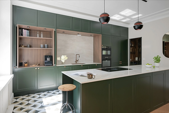
The paint colours for larger surfaces are based on warm and timeless shades in three different depths, with undertones of khaki, clay plaster and the subtle green hues found in limestone.
The contrasting shades range from sandy, earthy reds to brighter sage and deep forest green.
The flooring and other wood tones are slightly muted and softened, creating a balanced and harmonious overall palette.
This harmony is timeless yet contemporary. It evokes a strong connection with nature and creates a particularly calming atmosphere.
Clay-like and varied green tones beautifully enhance natural materials and textures. Organic shapes further complement the effect of the colours, as seen, for example, in the Organic Modern interior style.
This harmony also has its very own signature white — a beautiful shade that blends effortlessly with the other colours and materials within the palette.
Timeless Linen
Welcome
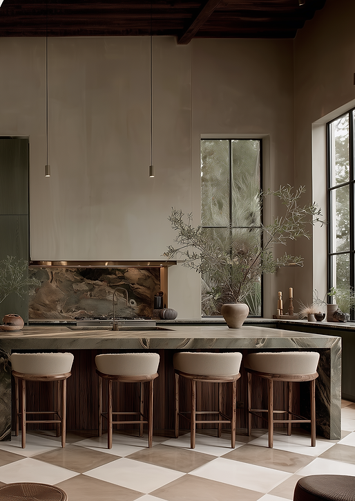
The paint colours for larger surfaces are based on cool and timeless neutral shades in three different depths, with subtly blue and gray undertones.
This harmony also features a contemporary off-white — a milky, Cloud Dancer-inspired white.
The contrasting shades include soft grey neutrals, cool deep tones, pure white accents and rich blues. Warmth is brought into this palette through the wood tones of the flooring and furniture.
This harmony has a particularly calming effect on us, as it evokes the peacefulness of the winter landscape. Warm accents, together with varied textures in materials and textiles, create balance and ensure that the interior never feels too cold, even in winter.
Warm lighting and abundant natural daylight are the perfect companions to this harmony.
Coming soon.....

Silent Horizon
Welcome
The colours for larger surfaces are built around creamy, timeless neutral shades in different depths, all with subtly warm undertones. Soft butter yellows bring warmth, while sandy browns, taupe, soft pinks and classic deep greens create beautiful contrast.
Golden Ratio creates an elegant foundation for vintage and classic interiors, yet in its lighter expression it blends seamlessly with today’s soft, modern minimalism.
Natural wood, stone and other carefully selected materials complete the harmony. Its signature off-white brings all the elements together, creating a warm and cohesive foundation throughout the home.
A timeless palette with a sense of heritage — designed to work beautifully with art, colour, pattern and wallpaper from room to room.

Golden Ratio
Welcome
The paint colours for larger surfaces are based on cool, modern shades in three different depths, with subtle hints of soft lilac in their undertones.
The contrasting shades in this harmony include deep brown, violet, mauve and bronze. The lighter version features beautiful cool, muted earth tones and belongs to the popular family of mushroom shades — specifically, its cooler interpretation.
This harmony is sophisticated and urban, combining colours and materials in an exceptionally elegant and contemporary way. It is particularly well suited to creating stunning interiors inspired by the quiet luxury aesthetic.
The flooring and wood tones are cool, yet authentic and naturally beautiful. The harmony’s signature white brings everything together into a cohesive and beautifully balanced whole.
Coming soon.....

Nordic Bark

A note from the creator of the harmonies!
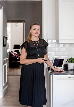
I created the Interior Harmonies by drawing on 25 years of experience as an interior architect and a lifelong fascination with colour, materials and the way our surroundings make us feel.
I believe that when our home is beautiful and harmonious, it can strengthen our sense of calm, comfort and belonging. And when we make aesthetic choices that reflect our own personal sense of beauty, a home begins to feel familiar, meaningful and truly our own.
The idea behind the Interior Harmonies is simple: everyone should be able to choose a colour and material world that resonates with them personally, while having the confidence that every element has been professionally selected to work beautifully together.
At the heart of every harmony is also something we all share — our innate connection to nature. My work is deeply influenced by biophilic design, colour psychology and my interest in how our surroundings affect our nervous system and well-being. I find it endlessly fascinating that one colour can make us feel at ease, while another combination can create a subtle sense of restlessness.
The Interior Harmonies bring together everything I have learned throughout my career about colour, undertones, natural materials and the combinations that remain beautiful year after year. They are also shaped by what I have learned from my clients — the colours and materials they have loved, even when their personal sense of beauty has been very different from my own.
When selecting materials, I also value longevity, natural beauty and thoughtful, sustainable choices. My hope is that these harmonies will help you create a home that not only looks beautiful, but feels like yours.
Warm Regards,
Interior architect
Heini Hansio